I noticed there doesn't seem to be any review of e-ink reader in here, apart from the 2 e-reader review that was done in 2011. In LYN Book Club subforum got one thread for Kindle which last post is in 2016. I'm here to give review and thought on these 2 e-readers that I have, the Kobo Aura One 7.8 inch which I purchase more than 2 years ago around RM1100 and Kobo Clara HD 6.0 inch which I purchase few months ago around RM600.
Now, when mentioning e-ink reader most people would only know Kindle, and the better model Paperwhite. I thought about buying it last time too but after reading how hassle it was to sideload ebook and also it support less format I decided to go with Kobo. Last time I also wanted bigger screen than 6 inch for reading manga, that time the choice were Aura One and Kindle Oasis, decided against Oasis because the higher price, only 7 inch screen, and earlier mention hassle. After using for a year I found while 7.8" is great for manga and if you properly seating for reading, it's not great at all for portability and holding with one hand. So I decided to get the 6 inch for purely reading e-book.
![user posted image]()
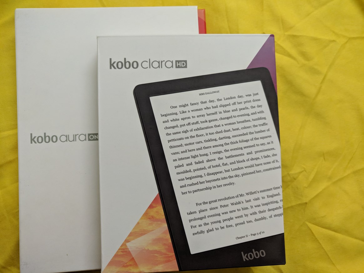
The boxes
![user posted image]()
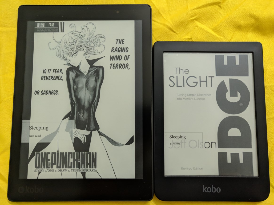
Aura One and Clara HD side-by-side
Design and build quality
Both devices are made of plastic but you don't feel like it's a cheap device. The build quality is superb, no creaking or flexing on both devices. Both devices only have micro-USB port and power button, there's no physical button for page turning. Aura One have a big blue power button at the back which you can easily find without looking, Clara HD have a small button at bottom which sit flush and that makes it harder to press it, the good point is it's harder to accidentally press it. Still I feel Aura One button placement is much better. Aura One dimension is 195.1 x 138.5 x 6.9 mm while Clara HD is 159.6 x 110 x 8.35 mm. Aura One is certified IPX8-rated water-resistance, up to 60 mins in 2 meters of water, so you can bring it to tub, pool, or even in rain without worrying about damaging the reader. Clara HD unfortunately have no water resistance so you need to be extra careful when near water.
![user posted image]()
Both have a textured back, it helps to give your finger a better grip on device. With the adequate bezel on the side of the screen both devices can be held with one hand, just Aura One will make the hand tired much earlier. Aura One have flush bezel with screen while Clara HD bezel is not flush with screen. I prefer flush screen as you'll feel the text is directly in front like when you looking at the text in book. With Clara HD bezel there's shadow which make you feel the text is at behind a thick bezel, sort of like old monitor with thick bezel, it kills the immersion. The plus side is the raised up bezel help to avoid the screen from being scratched.
Both is using Freescale SoloLite 1Ghz and storage is 8GB, usable 6.5GB with no support for SD card. There's also Aura One model with 32GB storage. It doesn't have speaker or even bluetooth, so no audio book.
Screen
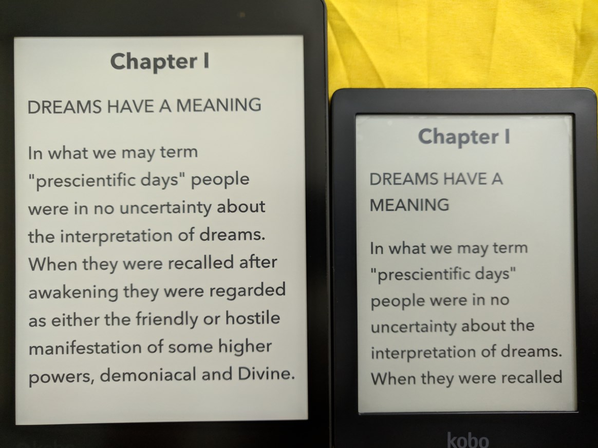
Aura One screen resolution is 1872x1404 while Clara HD is 1448x1072. Both have same 300ppi which makes the text or image looks very smooth, no jagged edge up close. Both screen have backlight with ComfortLight PRO which help to reduce eyes strain when using on night time, something like night light. Aura One is lit by nine white LEDs and eight RGB LEDs around the frame. The additional RGB LEDs allow the device to have a night reading mode that limits the blue light that comes from white LEDs. Clara HD have eight white LEDs and seven orange LEDs. Reading on e-ink is similar to reading on paper, there's no glare unlike LCD screen which make your eye strain. Even with backlight it does not blast light to your eyes, it just shine light to the screen.
![user posted image]()
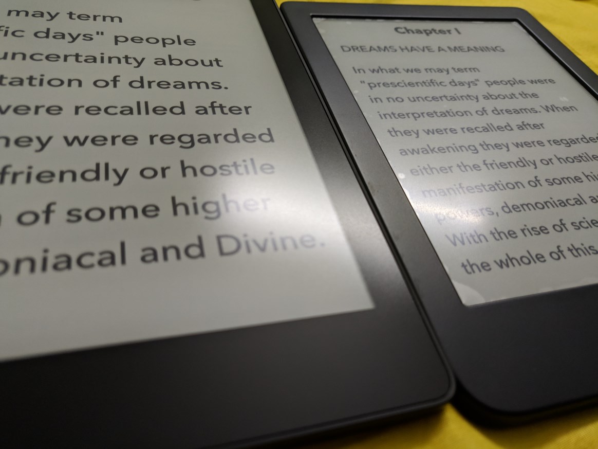
Pardon my photography skill, somehow the photo only sharp at middle while blur for the sides. In actual both screen text looks very nice with it's high ppi. Those with eagle eye will notice there's plastic matte screen protector on Clara HD, this is another issue with e-ink which I'll explain later. In not so bright lighting the screen looks a bit greenish. If at outside with sunlight the screen will look whitish.
![user posted image]()
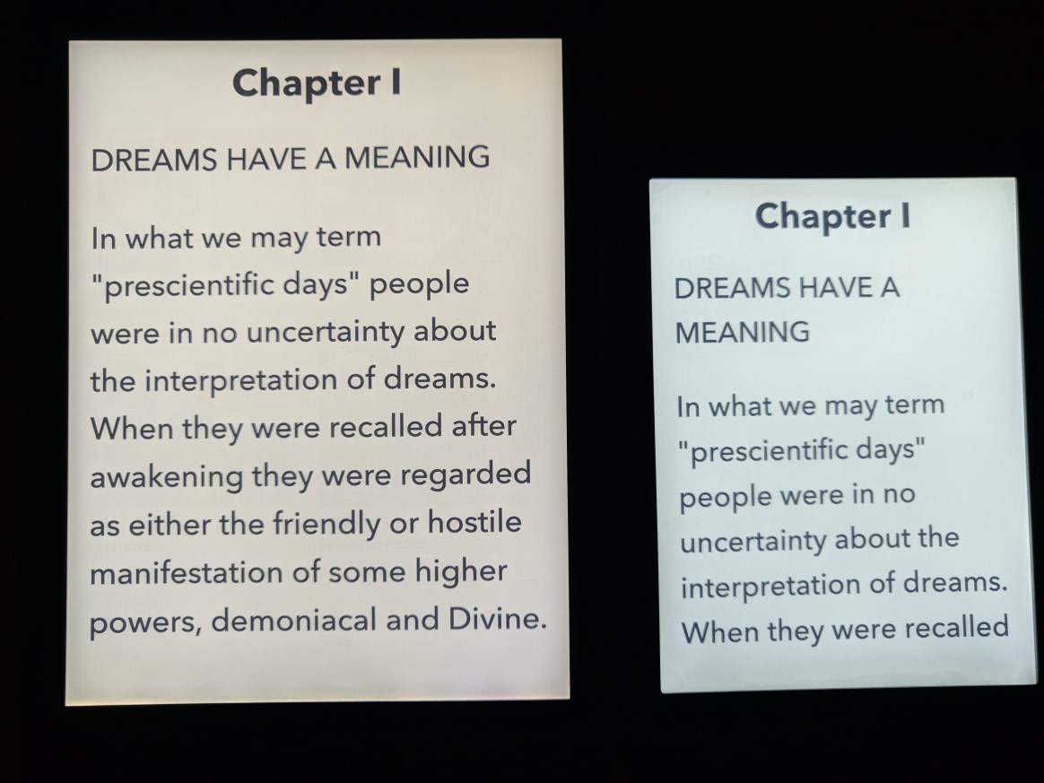
With backlight, Aura One give a bit warmer colour while Clara HD more whitish colour. 7.8" is just much better for manga, you can see more details of the drawing.
![user posted image]()
Backlight at 100% in dark room
![user posted image]()
Both night light at 100%. Aura One is saturated orange colour (photo come out look like red) while Clara HD more like half saturated yellow colour.
Personally I prefer Aura One night light as I feel less eye strain from it.
Now let's talk about e-ink and screen protector. Obviously like handphone or tablet, the first thing I look for when I got my Aura One is a screen protector. Got myself a clear screen protector as wanted to preserve the screen clarity, especially important for manga. And I remove the screen protector almost immediately after I apply it because it become too much reflective I feel like looking at tablet screen instead. Plus the plastic makes the finger feels swiping on smooth surface (Additional note: both devices actual screen does not feel smooth like glass, it were purposely to be rough like that to mimic the feeling like when swiping on paper). Imagine how much reflective it would be if I have gotten a glass screen protector. With Clara HD since I gonna use it solely for text reading I thought it will have less problem if to put screen protector, I gotten matte protector this time to avoid the screen become reflective. Fortunately the matte screen protector also have the rough texture so it able to preserve the feeling like swiping on paper. Yet it still have issues.
![user posted image]()
I'm not sure this photo able to show how it looks like when there's light that reflective on the screen. On Aura One without screen protector the reflective light feels like it's on the text and disperse more so it's not too disturbing. On Clara HD the reflective light more concentrated on the screen protector which make the text harder to read and it also create the annoying feel of a layer of screen above the text. The matte properties of the screen protector also make the text look less sharper, it feels like the screen is 720p with the screen protector and 1080p without it. It totally defeat the purpose of having e-ink display and 300ppi sharpness. Maybe I'm just too much OCD on this. In the end I remove the screen protector. Screen protector is like Kryptonite to e-ink display.
Continue next post
Now, when mentioning e-ink reader most people would only know Kindle, and the better model Paperwhite. I thought about buying it last time too but after reading how hassle it was to sideload ebook and also it support less format I decided to go with Kobo. Last time I also wanted bigger screen than 6 inch for reading manga, that time the choice were Aura One and Kindle Oasis, decided against Oasis because the higher price, only 7 inch screen, and earlier mention hassle. After using for a year I found while 7.8" is great for manga and if you properly seating for reading, it's not great at all for portability and holding with one hand. So I decided to get the 6 inch for purely reading e-book.
The boxes
Aura One and Clara HD side-by-side
Design and build quality
Both devices are made of plastic but you don't feel like it's a cheap device. The build quality is superb, no creaking or flexing on both devices. Both devices only have micro-USB port and power button, there's no physical button for page turning. Aura One have a big blue power button at the back which you can easily find without looking, Clara HD have a small button at bottom which sit flush and that makes it harder to press it, the good point is it's harder to accidentally press it. Still I feel Aura One button placement is much better. Aura One dimension is 195.1 x 138.5 x 6.9 mm while Clara HD is 159.6 x 110 x 8.35 mm. Aura One is certified IPX8-rated water-resistance, up to 60 mins in 2 meters of water, so you can bring it to tub, pool, or even in rain without worrying about damaging the reader. Clara HD unfortunately have no water resistance so you need to be extra careful when near water.

Both have a textured back, it helps to give your finger a better grip on device. With the adequate bezel on the side of the screen both devices can be held with one hand, just Aura One will make the hand tired much earlier. Aura One have flush bezel with screen while Clara HD bezel is not flush with screen. I prefer flush screen as you'll feel the text is directly in front like when you looking at the text in book. With Clara HD bezel there's shadow which make you feel the text is at behind a thick bezel, sort of like old monitor with thick bezel, it kills the immersion. The plus side is the raised up bezel help to avoid the screen from being scratched.
Both is using Freescale SoloLite 1Ghz and storage is 8GB, usable 6.5GB with no support for SD card. There's also Aura One model with 32GB storage. It doesn't have speaker or even bluetooth, so no audio book.
Screen
Aura One screen resolution is 1872x1404 while Clara HD is 1448x1072. Both have same 300ppi which makes the text or image looks very smooth, no jagged edge up close. Both screen have backlight with ComfortLight PRO which help to reduce eyes strain when using on night time, something like night light. Aura One is lit by nine white LEDs and eight RGB LEDs around the frame. The additional RGB LEDs allow the device to have a night reading mode that limits the blue light that comes from white LEDs. Clara HD have eight white LEDs and seven orange LEDs. Reading on e-ink is similar to reading on paper, there's no glare unlike LCD screen which make your eye strain. Even with backlight it does not blast light to your eyes, it just shine light to the screen.
Pardon my photography skill, somehow the photo only sharp at middle while blur for the sides. In actual both screen text looks very nice with it's high ppi. Those with eagle eye will notice there's plastic matte screen protector on Clara HD, this is another issue with e-ink which I'll explain later. In not so bright lighting the screen looks a bit greenish. If at outside with sunlight the screen will look whitish.

With backlight, Aura One give a bit warmer colour while Clara HD more whitish colour. 7.8" is just much better for manga, you can see more details of the drawing.
Backlight at 100% in dark room
Both night light at 100%. Aura One is saturated orange colour (photo come out look like red) while Clara HD more like half saturated yellow colour.
Personally I prefer Aura One night light as I feel less eye strain from it.
Now let's talk about e-ink and screen protector. Obviously like handphone or tablet, the first thing I look for when I got my Aura One is a screen protector. Got myself a clear screen protector as wanted to preserve the screen clarity, especially important for manga. And I remove the screen protector almost immediately after I apply it because it become too much reflective I feel like looking at tablet screen instead. Plus the plastic makes the finger feels swiping on smooth surface (Additional note: both devices actual screen does not feel smooth like glass, it were purposely to be rough like that to mimic the feeling like when swiping on paper). Imagine how much reflective it would be if I have gotten a glass screen protector. With Clara HD since I gonna use it solely for text reading I thought it will have less problem if to put screen protector, I gotten matte protector this time to avoid the screen become reflective. Fortunately the matte screen protector also have the rough texture so it able to preserve the feeling like swiping on paper. Yet it still have issues.
I'm not sure this photo able to show how it looks like when there's light that reflective on the screen. On Aura One without screen protector the reflective light feels like it's on the text and disperse more so it's not too disturbing. On Clara HD the reflective light more concentrated on the screen protector which make the text harder to read and it also create the annoying feel of a layer of screen above the text. The matte properties of the screen protector also make the text look less sharper, it feels like the screen is 720p with the screen protector and 1080p without it. It totally defeat the purpose of having e-ink display and 300ppi sharpness. Maybe I'm just too much OCD on this. In the end I remove the screen protector. Screen protector is like Kryptonite to e-ink display.
Continue next post